Design Rules for a Game-Changing Content Hub

Share this story
What’s the design strategy behind adidas’ gorgeous GamePlan A? Senior designer Anastasia Lyutikova answers our questions.
I’ve looked at a lot of content hubs this year. Dozens.
I’ve seen awful ones. I’ve also seen great ones, with much to admire and study. But when I chanced across adidas’ GamePlan A, I fell in love.
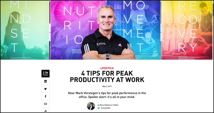
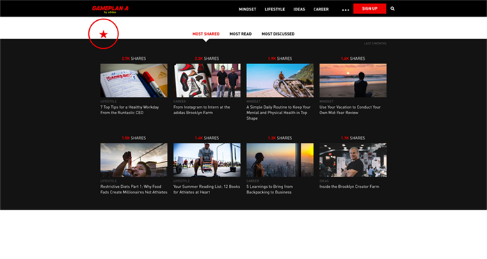
It’s modern. It’s smart. It has real voices, real ideas. It’s clean and full of white space, yet bursting with stuff you want to spend time with: long-form articles, grabby lists, pull quotes, videos and user-generated content. The hub has big photography and bold headlines. It tallies social shares for peer validation. The whole experience feels useful, smart, flexible—and alive.
Well done, adidas.
In reality, of course, it surely wasn’t effortless. It takes a lot of work to make something seem so simple.

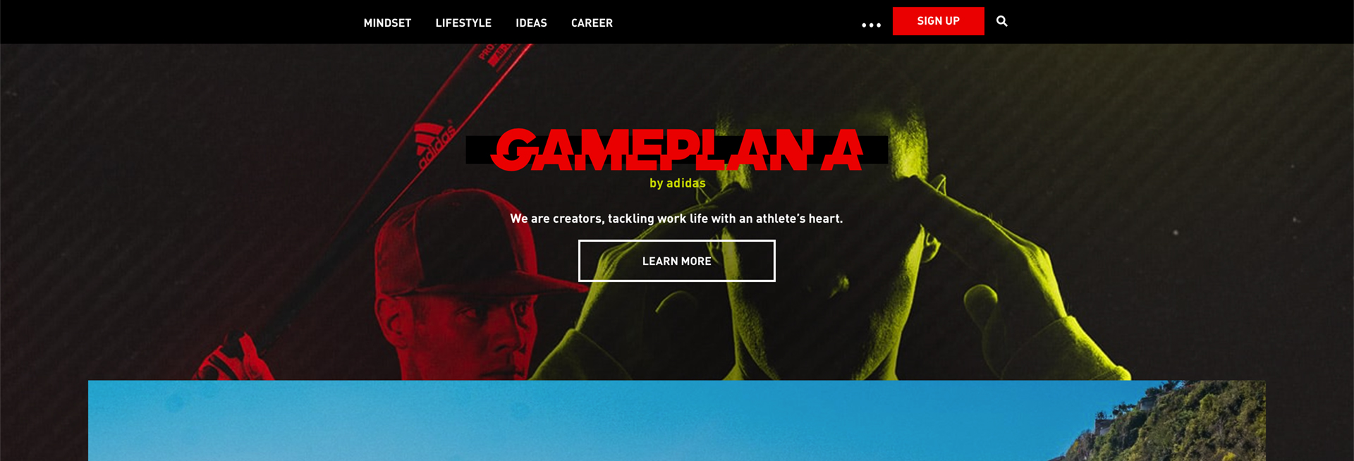
Adidas launched GamePlan A in 2016 to build a global community of like-minded people who carry their active attitudes into their work and lives. The site features content in four pillars—Mindset, Lifestyle, Ideas and Career—and its tagline pumps its fist in the air to announce the start of a movement: “We are creators, tackling work life with an athlete’s heart.”
My go-to sport is Pilates, and although I don’t necessarily tackle work with an athlete’s heart, GamePlan A is so well done, I want in.
Inspiring “user interaction” is exactly what lead designer Anastasia Lyutikova was going for when she designed this game-changing digital experience, she told me in a conversation from Germany. Lyutikova is senior art director at Scholz & Volkmer, a creative agency for digital brand management with offices in Wiesbaden and Berlin. Its award-winning clients include Mercedes-Benz, Coca-Cola and, of course, adidas.
Here are highlights from my back-and-forth with Lyutikova:
Q: When you started thinking about GamePlan A, what were your goals for its design strategy? What did you want users to feel, learn and do after visiting it?
Our goal was to inspire all those users with an athlete’s heart, which is adidas’ strategy for GamePlan A, and to make them feel actively involved. We were inspired by the motto “Be a playmaker and not a spectator.” The user should feel like part of the community. We wanted to combine user interaction with the design experience.
Q: What ideas, colors and philosophies inspired your design strategy?
It was important for us to develop an independent design language that directly addresses the target group: people who are constantly on the move, want to develop professionally and privately, and stay in balance. The word “dynamics” guided our design and is reflected in our use of the color red and different animation forms. These striking elements reflect the strong and sporty energy and contrast with the clear, flat design.
Q: What do you think are do’s and don’ts of the best digital magazine design experiences?
Do’s:
The user—not the design—is the focus. The designer always has to bear in mind the needs of the target group when developing. Whether the platform should be noisy or quiet depends on the user, not the designer.
Be consistent. Create stand-alone design guidelines, which can be used as a guide throughout the entire website and quickly lead the user to the content. A clear structured design language greatly supports user guidance.
The first impression counts. The more tangible the content and the quicker the user arrives at the content, the longer they are busy with it. The user sees the targeted content through clear design.

Don’ts:
Design that fails to communicate with the target group. One can have good design that does not fit the user.
Overloading the web page with too many different design elements leads to confusion.
Not having clear user guidance. Nothing is worse than a frustrated user who doesn’t understand the site and leaves immediately.
Q: Do you think of GamePlan A as a digital magazine, a digital content hub or something else entirely?
It is a symbiosis of both. We have developed a platform that presents exciting and relevant content in the form of a digital magazine. The design and content work together and complement each other. Large-scale images and a diverse gallery, typographic elements, and a one-page layout provide the optimum scope for good storytelling.
Q: How is digital magazine design more or less challenging than print magazine design?
The challenge in web design is the permanent connection between medium and user and the ever-evolving digital formats. It requires high flexibility, fast adaptation of new forms of interaction and a constant “up-to-date” design concept. Static media such as magazines and books have a long history, while the digital arena is still in the beginning stages. It requires a great deal of empathy to create intuitive and lively user environments and interfaces.
To enable a holistic communication between the reader and the platform, other media was developed for the GamePlan A program, including, among other things, a dedicated print edition.
Q: The site prioritizes mobile, social, curated and user-generated content. How do you optimize these experiences with your design decisions?
Curated content is very important for GamePlan A. We simply want to provide the target group with the most complete and relevant content possible. This includes curated content from other external websites.
Social and UGC can be viewed together in a certain way. A major goal of GamePlan A (or the idea behind it) is to form a community. This is where commitment to social and UG content plays a significant role. Therefore, the site is designed to make it easy for the user to participate no matter whether sharing content (via social media), subscribing to updates (or, in the future, a more content-driven newsletter) or requesting something (link, quote, topic).

Equally important is a prominent comment function, for example the “most discussed articles.” Users, or rather team members, who participate will be featured to further promote the community’s thoughts and to encourage them to participate and to help shape it … for this, GamePlan A would like to invite everyone.
Q: What’s surprised you most about designing GamePlan A?
We were lucky to be relatively quick to agree on what we were saying with the site and what goals we should pursue, so I quickly had a clear look and feel as a designer. We owe this quick response to a good cooperation with the adidas team and the editorial staff. We are constantly trying to continue working on GamePlan A and learning from the users to further improve the platform.
Q: What are your other favorite digital magazines out there and why?
Kinfolk and Yatzer. They convince with a clear, minimalist design and well-presented content. You can feel in every story the attention to detail, whether it is about content or design competence. I think the magazine is best managed to make the reader a user.
Hopes&Fears. It has well-designed content, for those who read a lot, with a simple structure and the focus on good user guidance. Everything an online magazine needs.
Q: Where do you think digital content hubs/digital magazines are going?
Micro-Interaction: The technology is evolving ever further so that a more complex interaction design on the web is no longer the focus, and will continue to spread even further in the near future. (Micro-interactions inform the user what is happening, what has happened and what will happen.)
Storytelling: Hero images with parallax effects, different modes of the multimedia representation, whether video or animated GIF, basically everything a story tells is fully on trend. It is still supported with the scrolling trend so that the user always remains in the read-flow.
Individuality: is very important in an internet landscape where many websites are already very similar to WordPress. Illustrations, authentic photos and self-created typography give the web pages a personal touch.
Thank you, Anastasia. Your GamePlan A is truly game-changing.
Intrigued? Check out our three-part series on content hubs:


