3 Ways to Evolve Your Alumni Magazine

Share this story
How to craft a university magazine readers will grab right out of the mailbox—and beyond.
Here’s a confession that might make my colleagues cringe: When I receive emails from my two alma maters, they usually end up in my trash. Blame inbox fatigue, or the fact that I have several other daily or weekly email newsletters that take priority.
On the flip side, when magazines from these same universities hit my mailbox, I flip through them right away. Even if I don’t have time right then to go cover to cover, I come back to them when I have quiet time to read and absorb them.
Granted, I’m a focus group of one, but I’m also not alone in my love of a great print experience. If you want to create—or evolve—a winning alumni publication, start with the tips below.
1. Start with your business goals—always
If you think all alumni magazines have the same goals, think again. A magazine tied to an alumni association might measure success in terms of joins and member retention, so the content needs to subtly tell stories of member benefits and give readers a tangible sense of added value. On the other hand, a general university magazine might focus more heavily on engagement metrics and ask, how much do readers learn and connect as a result of this content?
The target audience factors into these goals. For example, Georgetown Business magazine—produced by the Georgetown McDonough School of Business and Imagination (full disclosure)—goes not only to alumni but also to faculty and administrators at leading business schools around the country. The goal: Boost Georgetown McDonough’s reputation among the stakeholders who influence national rankings.
That goal helps drive the content. For example, a recent feature story dove deep into the emerging field of financial technology, or fintech. The sources ranged from alumni who have prominent positions in the field to faculty researchers publishing papers about it.

The impression readers get: Georgetown McDonough is at the forefront of mastering fintech. Ultimately, even readers without a “Hoya” connection should learn something by reading it.
2. Go beyond the usual suspects
The alumni profile is a magazine staple for a reason. These success stories provide a human connection for readers and points of pride for a university or school.
But in your search for good profiles, go beyond the C-suite or those who have achieved a high title at a known company or institution. Think about the definition of “success” and what readers will find interesting—beyond simply pleasing high-level donors. They’re important, naturally, but they’re also not your only audience.
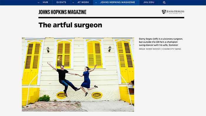
For example, Georgetown Business regularly features young alumni doing interesting or unexpected work, such as a recent graduate who built a business out of a popular Instagram handle. And when Johns Hopkins Magazine profiled a surgeon who performs life-saving procedures, it focused on what makes him interesting outside the OR: his championship swing dancing.

It’s still a VIP story, but it comes with a surprising twist. If you can surprise your readers, they’re more likely to find something to love about their alumni magazine—and the university that provides it to them.
3. Think beyond the page
Flipbooks are a stopgap technology that has overstayed its welcome, yet many alumni magazines still rely on it for their “online presence.”
Flipbooks, even ones with interactive features, are never going to have the level of searchability, shareability and trackability you get from individual article pages designed for a digital environment. The user experience suffers, too. Ask yourself, how many of our readers are mobile-first? Then imagine them trying to read a magazine-style layout on a screen that fits in their pocket. Are they likely to persist? Are they likely to share?
You’re better off with a magazine hub that serves up stories on an individual basis, with benefits for both search engines and your social media program. The perpetually lauded Stanford Magazine does this well. So does the University of Central Florida’s (UCF) Pegasus magazine.
If you’re worried about losing a beautiful, intricately designed magazine style, take heart—the move toward longform digital design means you can add just as much creativity to a digital piece as you can to a print spread. And you can add complementary media such as video and audio in the process. Take a look at this story from UCF, for example, which tells the story of bees on campus through a visually engaging mix of illustration, video and infographic elements.

Bonus: It looks great on a phone, too.


